April 12, 2018 in Blendkind
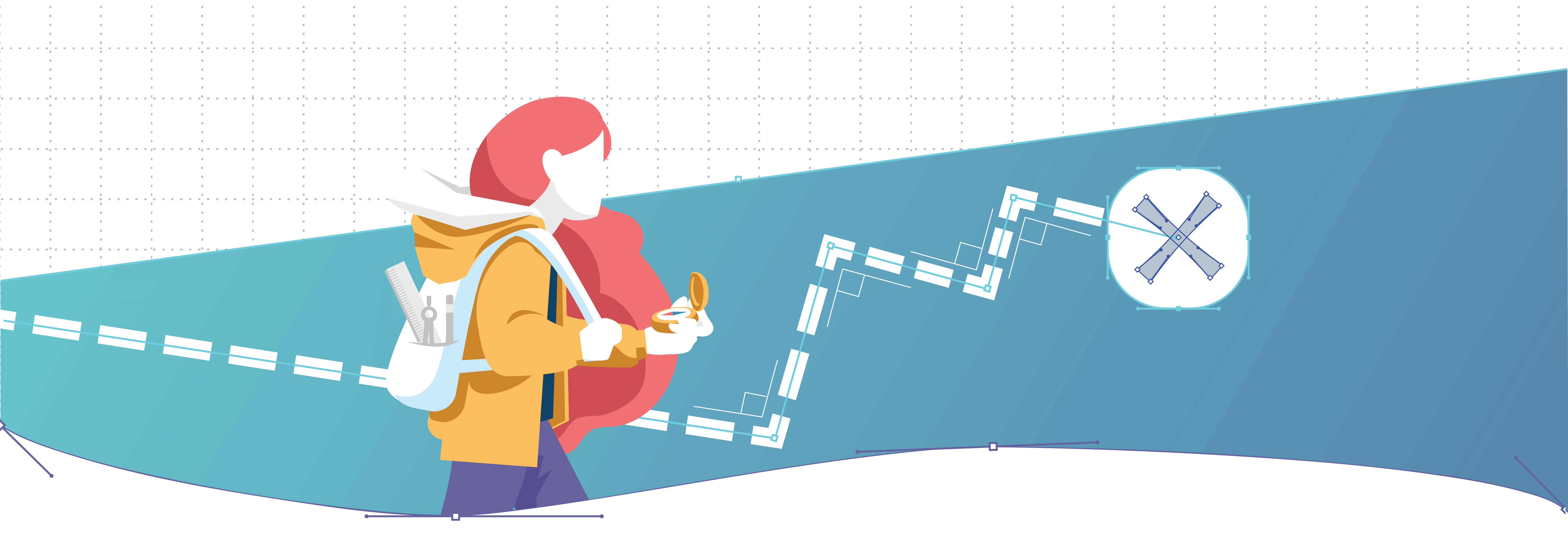
Making design decisions that scale
Designers — especially those working in industries long underserved by technology and design — are often on the frontier, confronted with new and unfamiliar challenges and evaluating how to create innovative, scalable solutions rather than ad-hoc, narrow fixes. As pioneers charting new paths into the unknown, we hold an increasing level of responsibility to ensure our experiences are intentionally crafted, reflect shared values, and consider the broadest range of impact.
At Blend, we’re reimagining the experience of getting a loan, partnering with banks and lending institutions to make the process easier for borrowers, while building a healthier lending ecosystem for the future.
As a company positioned on the frontier of an enormous industry, we believe our decisions should always align with our principles. They act as a compass when we face unfamiliar challenges or difficult trade-offs, and force us to reckon with the choices made. More importantly, they encourage us to think beyond quick fixes in favor of building lasting impact.
Our principles work because they are collectively true: we crafted them together, steward them through regular conversations in a public, active Slack channel, and evaluate them quarterly to ensure they stay relevant.
Design systems should scale beyond UI
The design team has incorporated these company-wide principles into several aspects of our work, most prominently in the development of Blend’s core brand attributes, informing how we express our visual language and guiding how we collectively communicate. We’ve taken a similarly structured approach to UI pattern libraries throughout our product to ensure agile, consistent components across new features.
Yet when it comes to making important decisions around the core experiences we design, we’ve relied on a rough set of shared values and an implicit trust that every designer is considering them when building.
Why leave important decision-making to this approach? Because defining and maintaining principles is hard. Developing one shared language across a team is challenging enough. It’s even more difficult to build a framework that spans several parameters:
- Inform all disciplines of the team: Brand Design, Product Design, Content Strategy, User Research, Design Operations
- Specific enough to provide meaningful, relevant guidance — especially when confronted with difficult trade-offs
- Capture what makes our team and our work uniquely us
- Future-proofed, or at least able to withstand revisions
- Concise and inspirational to encourage quick recall and ease of use
Up until early this year, we had been able to put off these deliberations due to our team’s small size. But as we continued to grow, it became more evident that investing in them now was well worth the cost.
Building a framework for decision-making
We’d been collecting ideas for years (Defining Principles was forever a segment of regular team off-sites), but it took a tipping point to bring these snippets to light and begin to build a manifesto around.
Great examples in our field were regularly brought up in conversation, and both the meaning and reach of the Blend company principles were cementing their importance. To stay innovative, we needed to capture our team’s creative difference, so we dedicated time to review our growing list and reflect on opportunities to update and refine.
Reflect & REVIEW
To encourage meaningful conversation around our current work and process, we considered several questions in advance:
Preserving the things we care most about
- What are your personal convictions when it comes to design?
- What concerns you about past or current design trends or approaches to designing?
Building a set of truths to reference
- When have you run into difficulty explaining why a decision you made fundamentally “felt right”?
- When have you disagreed with feedback, but didn’t feel empowered to voice it without a resource to help validate your reasoning?
Speaking a shared language
- When have you failed to convince others of a decision because you didn’t have the vocabulary to effectively articulate why?
- When has feedback been unproductive?
- When have you noticed a decision made differently here than you have experienced in the past?
This provided a ton of material to work from. So we brought the entire team together for the good part of a day to collect and discuss, with the ultimate goal of merging (and lots of deleting) the most representative points into a rough list we all felt good about. We left structuring and word-smithing for the next session.
Refine
To move more quickly, we assembled a smaller team to iron out the details. In a series of two additional sessions with a member from each function, we distilled the list from the group discussion into a concise set by considering:
Structure
Identifying patterns and relationships among themes
- Card sorting into thematic areas
- Creating sub-themes to describe each further and help inform design at both the concept and execution levels
Narrative
Establishing domain and context around each theme
- Situating each within our unique industry and workflows to ensure they feel relevant and meaningful
Syntax
Crafting rhythm and cohesion across themes
- Finding the right language to create good flow, make the set inspiring, and encourage consistency
Start with the story

Since design decisions are geared toward solving a problem, always begin by understanding the objectives and intended outcomes of a project.
Content drives design
Whether gathering research insights, collaborating on a spec, or aligning on a narrative, first lay a foundational outline or journey map to guide decisions.
Present with intent
Good design is transparent, obvious, and honest. Aim to maximize comprehension while minimizing decoration.
Advocate for your audience

Bringing clarity to the confusing industry of consumer finance means deeply understanding the mindset and motivations of all our users in order to champion the best experiences for them.
Guide with purpose and ease
Craft interactions that are intentional, effortless, and guide toward the correct path the first time. Remove excess burden whenever possible, but always favor clarity over clicks.
Leave no one behind
Our mission is to enable broader access to financial services. Embrace standards and patterns that ensure the fullest spectrum of usability and comprehension, and always seek to empower through education.
Consider every scenario

Building a configurable platform to span millions of borrowers across hundreds of unique lenders requires a concise and flexible design language.
Favor systems and reusable parts
Patterns that comprise a consistent and efficient framework help to improve comprehension and performance, and allow our work to scale across different configurations, platforms, and devices.
Situate your work in the real world
Optimize design for impact, considering its most distant end-state or use case.
Build a bridge to the future

Reinventing an industry requires innovative approaches, but in order to drive adoption of new paradigms, both their function and value must be easily understood.
Make the new feel familiar
Turn to proven patterns whenever possible. With novel interactions or concepts, consider adapting or enhancing existing mental models in unique ways.
Design beyond the display
Appreciate a feature’s potential value over its functional interface, always seeking to leverage technology, automation, or other tools to streamline an experience.
Seeing them in action
Our living document is inherently imperfect. But we feel it’s an essential step in our development as a team — and a way to inform decisions, structure feedback, and drive innovation as we scale.
But principles are only valuable to the extent that they are relevant and regularly used in critical decision making as a team. In a series of four subsequent posts, we’ll show how ours have proven to be incredibly useful tools, illuminating for us the correct path forward.
Find out what we're up to!
Subscribe to get Blend news, customer stories, events, and industry insights.
Meet Caitlin McGowan, Customer Success Manager at Blend
Get to know the builders, creative thinkers, and problem-solvers shaping the future of banking.
Read the article about Meet Caitlin McGowan, Customer Success Manager at Blend
Meet Ray Lin, Product Designer at Blend
Get to know the builders, creative thinkers, and problem-solvers shaping the future of banking.
Read the article about Meet Ray Lin, Product Designer at Blend
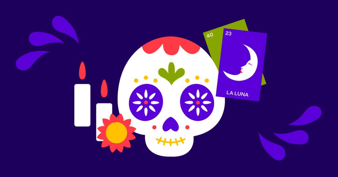
The importance of impact: Celebrating National Hispanic and Latinx Heritage Month with Blendísimo
Take a look at what Blendisimo – Blend’s Hispanic and Latinx ERG – has in store for Hispanic and Latinx Heritage Month, and why we believe making an impact is…
Read the article about The importance of impact: Celebrating National Hispanic and Latinx Heritage Month with Blendísimo